


PAYBACK Design System 2.0
PAYBACK Design System 2.0
Transformed fragmented design libraries into a unified, scalable system across iOS, Android, and web platforms, reducing development time for 50+ team members.
Role
User Experience Designer
Collaboration
2 Designers, 4 Developers+
Timeline
Mar 2025 - Aug 2025
Platform
Mobile (Android, iOS), Web
Outcome
67% faster component application 20% development acceleration
Context
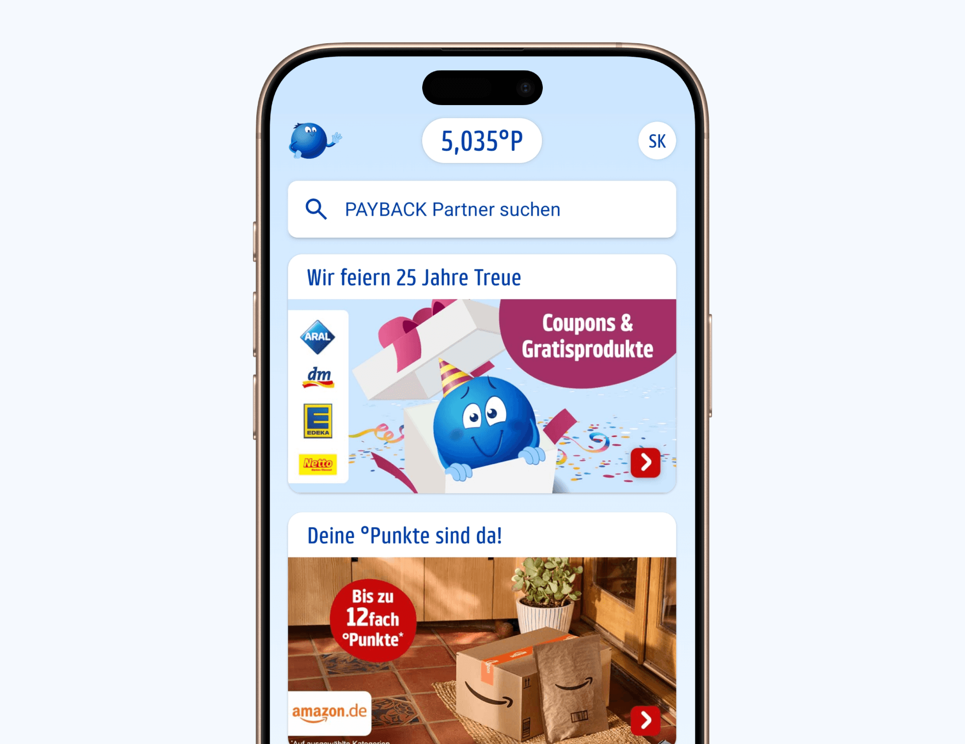
PAYBACK is a multi-partner loyalty platform serving 16M+ active app users across 4 countries
With system-wide ownership, I led the consolidation of fragmented design foundations across iOS, Android, and web platforms into a scalable, maintainable design system.
PAYBACK is a multi-partner loyalty platform serving 16M+ active app users across 4 countries
With system-wide ownership, I led the consolidation of fragmented design foundations across iOS, Android, and web platforms into a scalable, maintainable design system.
PAYBACK is a multi-partner loyalty platform serving 16M+ active app users across 4 countries
With system-wide ownership, I led the consolidation of fragmented design foundations across iOS, Android, and web platforms into a scalable, maintainable design system.
Challenge
Growing platform ecosystem required unified design foundations and systematic migration planning
Before I joined, PAYBACK had established design libraries for iOS and Android following respective platform guidelines. As the platform ecosystem continued to grow across mobile and web, the opportunity emerged to create unified foundations spanning all platforms. The transition from Material 2 to Material 3 presented ideal timing to systematically restructure our design approach.
Cross-platform alignment opportunities
Each platform had developed distinct design patterns, with web lacking systematic foundations entirely. This created opportunities to establish shared design principles while preserving platform-native experiences for our 34M+ users across different touchpoints.
System modernization needs
The Material 3 transition provided a natural inflection point to introduce unified design operations and scalable workflows across our design and development teams for all three platforms.
Solution
Built unified design foundations through layered architecture, semantic tokens, and systematic team alignment
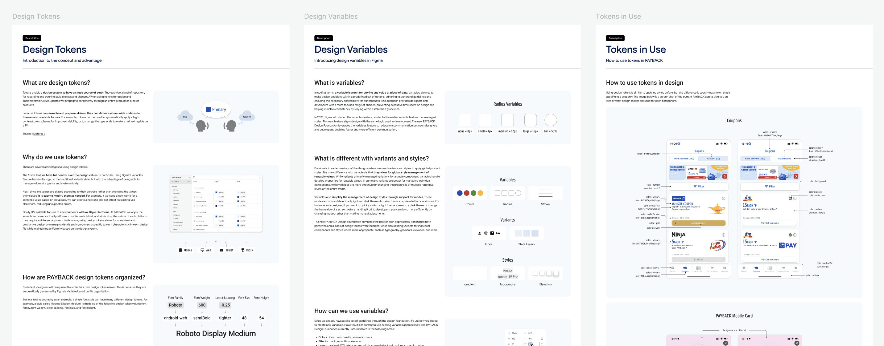
I redesigned the system architecture with a layered structure separating design foundations from platform-specific and feature-level components, enabling scalable development across iOS, Android, and web. To enable precise design-dev communication, I built a semantic token foundation with clear naming conventions that eliminated previous ambiguities. Components followed Material Design principles while incorporating PAYBACK's brand customizations, ensuring platform consistency without sacrificing brand identity. Through regular sync sessions with developers and continuous designer onboarding with comprehensive documentation addressing common questions, I transformed fragmented workflows into systematic, scalable design operations across all platforms.
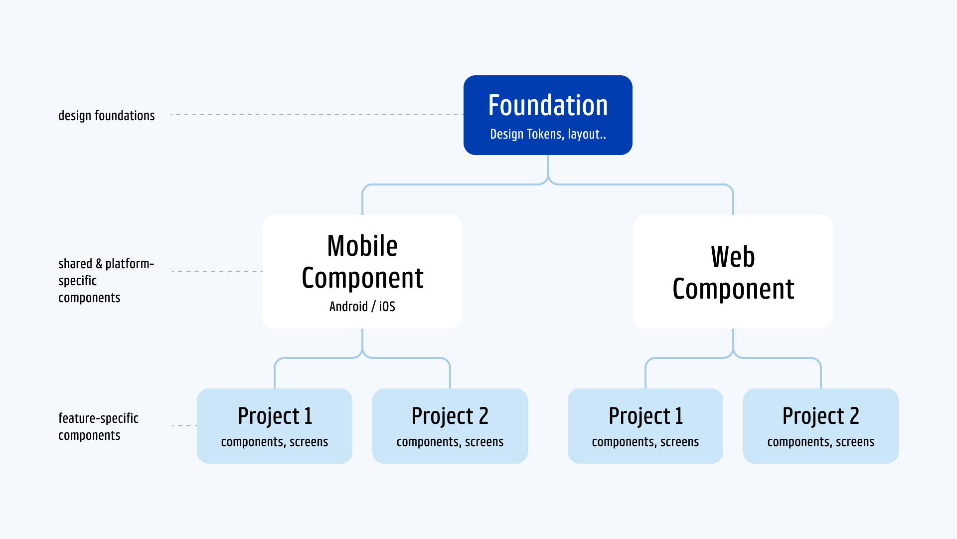
Built unified design foundations through layered architecture, semantic tokens, and systematic team alignment
I redesigned the system architecture with a layered structure separating design foundations from platform-specific and feature-level components, enabling scalable development across iOS, Android, and web. To enable precise design-dev communication, I built a semantic token foundation with clear naming conventions that eliminated previous ambiguities. Components followed Material Design principles while incorporating PAYBACK's brand customizations, ensuring platform consistency without sacrificing brand identity. Through regular sync sessions with developers and continuous designer onboarding with comprehensive documentation addressing common questions, I transformed fragmented workflows into systematic, scalable design operations across all platforms.


Result
Transformed design operations and team collaboration across 50+ designers and developers
The unified design system fundamentally changed how our team members collaborate and build products. Beyond component standardization, we established regular design-dev sync meetings that improved cross-functional alignment and reduced miscommunication. The systematic approach to design operations created sustainable workflows that continue to evolve with our growing ecosystem.
Cross-platform Design Consistency
Redesigned 20+ components with improved accessibility standards and consistent sizing principles, establishing unified design foundations across iOS, Android, and web platforms while enabling seamless cross-platform experience.
Team Operational Efficiency
Reduced component application time by 67% through reusable architecture. In one implementation project, developers achieved 20% faster development through readily available components.
Reflection
Systems thinking and strategic constraints drive impactful design decisions
Working on this design system taught me how small foundational changes—like refining a token or adjusting naming conventions—can ripple across entire product ecosystems. Regular collaboration with designers and developers was essential; their feedback helped me realize that successful design systems evolve continuously rather than being static deliverables. Clear documentation became a strategic tool for reducing ambiguity and smoothing daily workflows across teams. As a working student with limited time, I learned to prioritize high-impact interventions and drive systematic change through focused iterations rather than comprehensive overhauls.
soyeon.design@gmail.com
@ 2025 Soyeon Kim.

soyeon.design@gmail.com
@ 2025 Soyeon Kim.
soyeon.design@gmail.com
@ 2025 Soyeon Kim.